Ford Owners Want Simpler, Easier to Use Technology
- January 15, 2014
- Audi, BMW, Cadillac, Ford, More Categories...
- Posted by George Peterson
- Comments Off on Ford Owners Want Simpler, Easier to Use Technology
 In AutoPacific’s annual survey of new car and light truck buyers, eleven of the top twenty vehicles whose drivers want simpler, easier to use technology are Fords or Lincolns. Six are from Toyota or Lexus. One is from Cadillac. One is from BMW. One is from Audi. If you have been paying attention to Ford’s standings in Consumer Reports ratings and other customer satisfaction measurements, you undoubtedly have heard Ford’s and Lincolns ratings have dropped precipitously since MyFord/LincolnTouch was introduced.
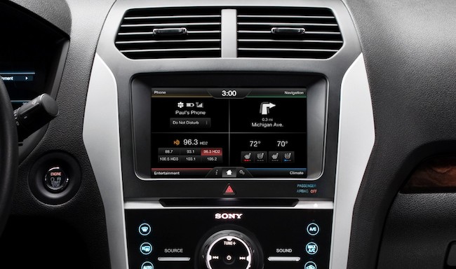
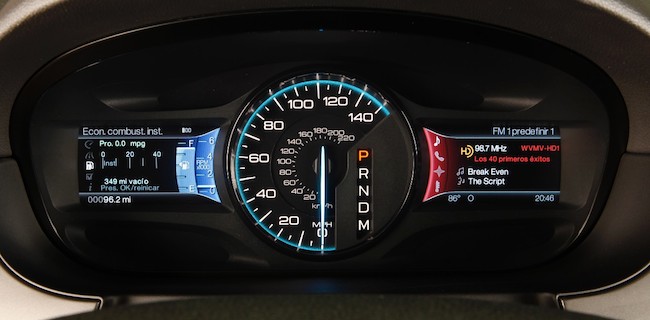
A whopping 43% of Lincoln MKT owners want simpler technology that is easier to use. The culprit? MyLincolnTouch, Ford Motor Company’s attempt to push the envelope of the human machine interface. In the 2013 iteration of MyFordTouch and MyLincolnTouch, the designers eschewed good old fashioned buttons and dials with a touchscreen interface where you need to hit the appropriate spot on the screen to activate a function. Clearly, given the percentage of Ford and Lincoln owners wanting a better interface, Ford pushed too hard. The latest iteration of MyFord/LincolnTouch is improved slightly by dividing the screen into quadrants that are easier to identify and locate. The instrument cluster remains a confusing mess controlled by steering wheel buttons.
When talking with Ford designers about the upcoming Lincoln MKC, we noted that some knobs and buttons have reappeared. The designer allowed that they had heard the criticisms of MyFord/LincolnTouch and were reacting by restoring some reason to the center stack and instrument cluster. It’s too bad that the lead times in the auto industry are what they are – years instead of weeks and months. Where a system and firmware upgrade may be all that is necessary, it takes an automaker (unless it is Tesla) an eon to make a substantial change.
The other systems challenging their drivers are in the Cadillac XTS – Cue with its haptic interface, BMW 5-Series – iDrive, no doubt, and Audi – MMI System Cue is an extremely colorful interface that attempts to emulate an iPad and fails. Its haptic feedback can be disconcerting to folks unfamiliar with the system. 33% of XTS owners want an easier to use system. Where iDrive was a disaster when it was launched, it has improved substantially over the years, but still 31% of 5-Series owners want a simpler system. Audi’s MMI system is relatively easy to understand, but 23% of Audi A6 owners want easier to use technology.
In the quest for advanced technology and winning the battlefield of the center stack, car makers have forgotten the rental car rule that states, “A driver should be able to enter a totally unfamiliar vehicle at midnight in the pouring rain and be able to start the vehicle, and adjust the seats, radio and climate controls instinctively.” No instructions required. We need to relearn that.

